devtools::install_github("r-lib/gert")

usethis::use_git_config(
  user.name = "Your name",
  user.email = "Email associated with your GitHub account"
)Lab 0 - Hello R!
Lab
Important
This lab is not a part of your grade in this course. You should still submit your completed lab to Gradescope to practice submitting to Gradescope and receive feedback. Since this lab precedes class lecture, you may be unable to complete the lab until next week.
This lab will introduce you to the course computing workflow. The main goal is to demo R and RStudio, which we will be using throughout the course both to learn the statistical concepts discussed in the course and to analyze real data and come to informed conclusions.
Note
R is the name of the programming language itself and RStudio is a convenient interface.
An additional goal is to reinforce Git and GitHub, the collaboration and version control system that we will be using throughout the course.
Note
Git is a version control system (like “Track Changes” features from Microsoft Word but more powerful) and GitHub is the home for your Git-based projects on the internet (like DropBox but much better).
As the labs progress, you are encouraged to explore beyond what the labs dictate; a willingness to experiment will make you a much better programmer. Before we get to that stage, however, you need to build some basic fluency in R. Today we begin with the fundamental building blocks of R and RStudio: the interface, reading in data, and basic commands.
To make versioning simpler, this and the next lab are solo labs. In the future, you’ll learn about collaborating on GitHub and producing a single lab report for your lab team, but for now, concentrate on getting the basics down.
By the end of the lab, you will…
- Be familiar with the workflow using R, RStudio, Git, and GitHub
- Gain practice writing a reproducible report using Quarto
- Practice version control using GitHub
- Be able to create data visualizations using
ggplot2
Getting started
Important
Your lab TA will lead you through the Getting Started and Packages sections.
Log in to RStudio
- Go to https://cmgr.oit.duke.edu/containers and login with your Duke NetID and Password.
- Click
STA198-199to log into the Docker container. You should now see the RStudio environment.
Warning
If you haven’t yet done so, you will need to reserve a container for STA198-199 first.
Set up your SSH key
You will authenticate GitHub using SSH. Below are an outline of the authentication steps; you are encouraged to follow along as your TA demonstrates the steps.
Note
You only need to do this authentication process one time on a single system.
- Type
credentials::ssh_setup_github()into your console. - R will ask “No SSH key found. Generate one now?” You should click 1 for yes.
- You will generate a key. It will begin with “ssh-rsa….” R will then ask “Would you like to open a browser now?” You should click 1 for yes.
- You may be asked to provide your GitHub username and password to log into GitHub. After entering this information, you should paste the key in and give it a name. You might name it in a way that indicates where the key will be used, e.g.,
sta199).
You can find more detailed instructions here if you’re interested.
Configure Git
There is one more thing we need to do before getting started on the assignment. Specifically, we need to configure your git so that RStudio can communicate with GitHub. This requires two pieces of information: your name and email address.
To do so, you will use the use_git_config() function from the usethis package. (And we also need to install a package called gert just for this step.)
Type the following lines of code in the console in RStudio filling in your name and the email address associated with your GitHub account.
For example, mine would be
devtools::install_github("r-lib/gert")

usethis::use_git_config(
  user.name = "Alexander Fisher",
  user.email = "alexander.fisher@duke.edu"
  )
You are now ready interact with GitHub via RStudio!
Clone the repo & start new RStudio project
Go to the course organization at github.com/sta199-sp23-1 organization on GitHub. Click on the repo with the prefix lab-0. It contains the starter documents you need to complete the lab.
Click on the green CODE button, select Use SSH (this might already be selected by default, and if it is, you’ll see the text Clone with SSH). Click on the clipboard icon to copy the repo URL.
In RStudio, go to File ➛ New Project ➛Version Control ➛ Git.
Copy and paste the URL of your assignment repo into the dialog box Repository URL. Again, please make sure to have SSH highlighted under Clone when you copy the address.
Click Create Project, and the files from your GitHub repo will be displayed in the Files pane in RStudio.
Click lab-0-datasaurus.qmd to open the template Quarto file. This is where you will write up your code and narrative for the lab.
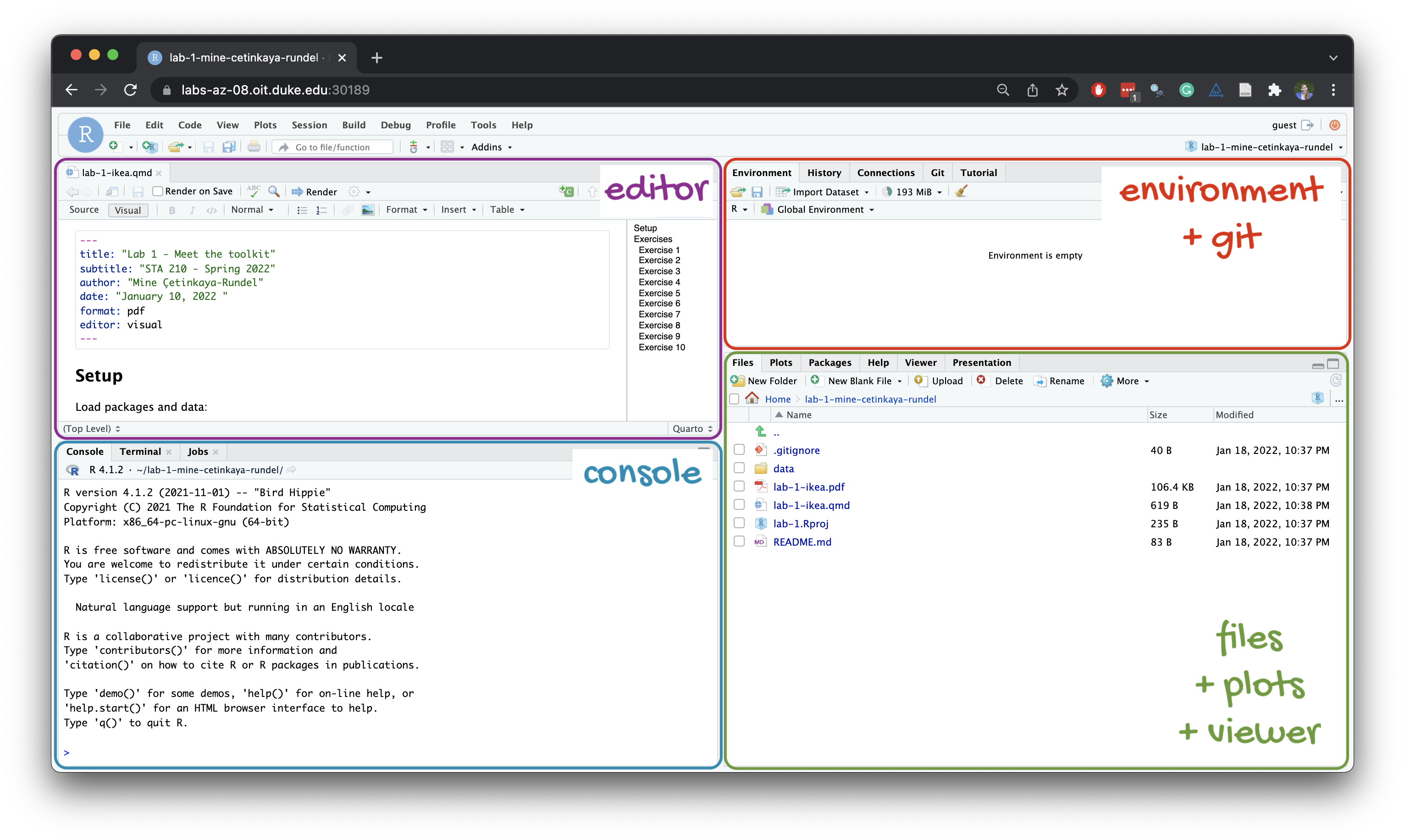
R and R Studio
Below are the components of the RStudio IDE.
Below are the components of a Quarto (.qmd) file.
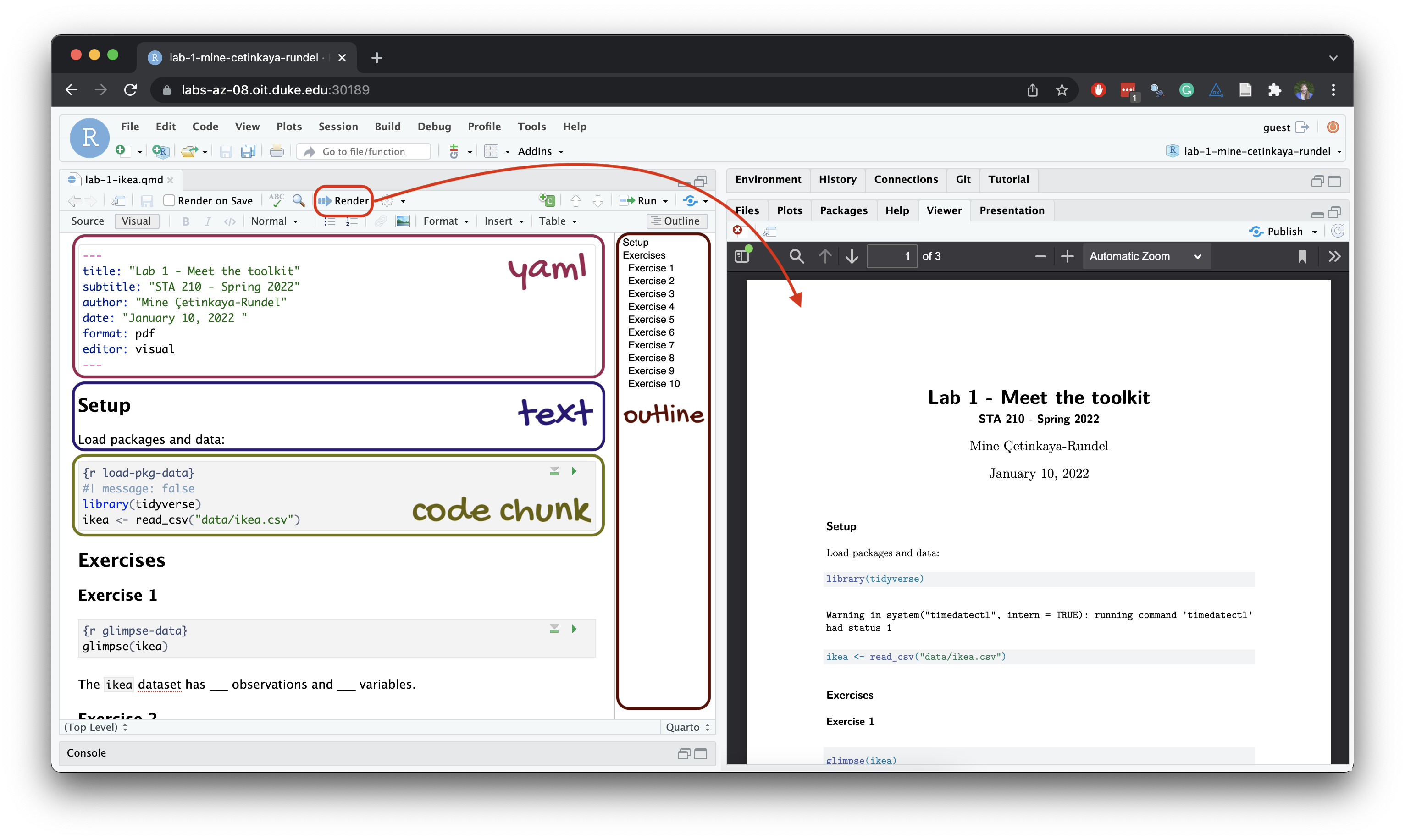
YAML
The top portion of your R Markdown file (between the three dashed lines) is called YAML. It stands for “YAML Ain’t Markup Language”. It is a human friendly data serialization standard for all programming languages. All you need to know is that this area is called the YAML (we will refer to it as such) and that it contains meta information about your document.
Important
Open the Quarto (.qmd) file in your project, change the author name to your name, and render the document. Examine the rendered document.
Committing changes
Now, go to the Git pane in your RStudio instance. This will be in the top right hand corner in a separate tab.
If you have made changes to your Quarto (.qmd) file, you should see it listed here. Click on it to select it in this list and then click on Diff. This shows you the difference between the last committed state of the document and its current state including changes. You should see deletions in red and additions in green.
If you’re happy with these changes, we’ll prepare the changes to be pushed to your remote repository. First, stage your changes by checking the appropriate box on the files you want to prepare. Next, write a meaningful commit message (for instance, “updated author name”) in the Commit message box. Finally, click Commit. Note that every commit needs to have a commit message associated with it.
You don’t have to commit after every change, as this would get quite tedious. You should commit states that are meaningful to you for inspection, comparison, or restoration.
In the first few assignments we will tell you exactly when to commit and in some cases, what commit message to use. As the semester progresses we will let you make these decisions.
Now let’s make sure all the changes went to GitHub. Go to your GitHub repo and refresh the page. You should see your commit message next to the updated files. If you see this, all your changes are on GitHub and you’re good to go!
Push changes
Now that you have made an update and committed this change, it’s time to push these changes to your repo on GitHub.
In order to push your changes to GitHub, you must have staged your commit to be pushed. click on Push.
Packages
In this lab we will work with two packages:
- datasauRus which contains the dataset, and
- tidyverse which is a collection of packages for doing data analysis in a “tidy” way.
Render the document which loads these two packages with the library() function.
Note
The rendered document will include a message about which packages the tidyverse packages is loading along with it. It’s just R being informative, a message does not indicate anything is wrong (it’s not a warning or an error).
The tidyverse is a meta-package. When you load it you get eight packages loaded for you:
- ggplot2: for data visualization
- dplyr: for data wrangling
- tidyr: for data tidying and rectangling
- readr: for reading and writing data
- tibble: for modern, tidy data frames
- stringr: for string manipulation
- forcats: for dealing with factors
- purrr: for iteration with functional programming
The message that’s printed when you load the package tells you which versions of these packages are loaded as well as any conflicts they may have introduced, e.g., the filter() function from dplyr has now masked (overwritten) the filter() function available in base R (and that’s ok, we’ll use dplyr::filter() anyway).
You can now Render your template document and see the results.
Data
The data frame we will be working with today is called datasaurus_dozen and it’s in the datasauRus package. Actually, this single data frame contains 13 datasets, designed to show us why data visualization is important and how summary statistics alone can be misleading. The different datasets are marked by the dataset variable.
Note
If it’s confusing that the data frame is called datasaurus_dozen when it contains 13 datasets, you’re not alone! Have you heard of a baker’s dozen?
Let’s also load these packages in the Console. You can do this by either typing the following in the console or clicking on the play button (green triangle) on the code chunk that loads the packages.
library(tidyverse)
library(datasauRus)
To find out more about the dataset, type the following in your console.
?datasaurus_dozenA question mark before the name of an object will always bring up its help file. This command must be run in the console. Alternatively, you can use the help() function.
help(datasaurus_dozen)Exercises
- Based on the help file, how many rows and how many columns does the
datasaurus_dozenfile have? What are the variables included in the data frame? Add your responses to your lab report.
When you’re done, commit your changes with the commit message “Added answer for Ex 1”,
Then, push these changes.
Let’s take a look at what these datasets are. To do so we can check th e distinct() values of the dataset variable:
datasaurus_dozen |>
  distinct(dataset)
# A tibble: 13 × 1
dataset
<chr>
1 dino
2 away
3 h_lines
4 v_lines
5 x_shape
6 star
7 high_lines
8 dots
9 circle
10 bullseye
11 slant_up
12 slant_down
13 wide_linesThe original Datasaurus (dino) was created by Alberto Cairo in this great blog post. The other Dozen were generated using simulated annealing and the process is described in the paper Same Stats, Different Graphs: Generating Datasets with Varied Appearance and Identical Statistics through Simulated Annealing by Justin Matejka and George Fitzmaurice.1 In the paper, the authors simulate a variety of datasets that the same summary statistics to the Datasaurus but have very different distributions.
Data visualization and summary
- Plot
yvs.xfor thedinodataset. Then, calculate the correlation coefficient betweenxandyfor this dataset.
Below is the code you will need to complete this exercise. Basically, the answer is already given, but you need to include relevant bits in your document and successfully render it and view the results.
Start with the datasaurus_dozen and pipe it into the filter function to filter for observations where dataset == "dino". Store the resulting filtered data frame as a new data frame called dino_data.
dino_data <- datasaurus_dozen |>
  filter(dataset == "dino")
There is a lot going on here, so let’s slow down and unpack it a bit.
First, the pipe operator: |>, takes what comes before it and sends it as the first argument to what comes after it. So here, we’re saying filter the datasaurus_dozen data frame for observations where dataset == "dino".
Second, the assignment operator: <-, assigns the name dino_data to the filtered data frame.
Next, we need to visualize these data. We will use the ggplot function for this. Its first argument is the data you’re visualizing. Next we define the aesthetic mappings. In other words, the columns of the data that get mapped to certain aesthetic features of the plot, e.g. the x axis will represent the variable called x and the y axis will represent the variable called y. Then, we add another layer to this plot where we define which geometric shapes we want to use to represent each observation in the data. In this case we want these to be points, hence geom_point.
ggplot(data = dino_data, mapping = aes(x = x, y = y)) +
  geom_point()
For the second part of this exercise, we need to calculate a summary statistic: the correlation coefficient. Correlation coefficient, often referred to as \(r\) in statistics, measures the linear association between two variables. You will see that some of the pairs of variables we plot do not have a linear relationship between them. This is exactly why we want to visualize first: visualize to assess the form of the relationship, and calculate \(r\) only if relevant. In this case, calculating a correlation coefficient really doesn’t make sense since the relationship between x and y is definitely not linear (it’s dinosaurial)!
For illustrative purposes only, let’s calculate the correlation coefficient between x and y.
Note
Start with `dino_data` and calculate a summary statistic that we will call `r` as the `cor`relation between `x` and `y`.
dino_data |>
  summarize(r = cor(x, y))
This is a good place to pause, render, and commit changes with the commit message “Added answer for Ex 2.”
Then, push these changes when you’re done.
- Plot
yvs.xfor thecircledataset. You can (and should) reuse code we introduced above, just replace the dataset name with the desired dataset. Then, calculate the correlation coefficient betweenxandyfor this dataset. How does this value compare to therofdino?
This is another good place to pause, render, and commit changes with the commit message “Added answer for Ex 3.”
Then, push these changes when you’re done.
- Plot
yvs.xfor thestardataset. You can (and should) reuse code we introduced above, just replace the dataset name with the desired dataset. Then, calculate the correlation coefficient betweenxandyfor this dataset. How does this value compare to therofdino?
You should pause again, render, commit changes with the commit message “Added answer for Ex 4”.
Then, push.
Finally, let’s plot all datasets at once. In order to do this we will make use of faceting, given by the code below:
Note
Facet by the dataset variable, placing the plots in a 3 column grid, and don’t add a legend.
ggplot(datasaurus_dozen, aes(x = x, y = y, color = dataset))+
  geom_point()+
  facet_wrap(~ dataset, ncol = 3) +
  theme(legend.position = "none")
And we can use the group_by function to generate all the summary correlation coefficients. We’ll go through these functions next week when we learn about data wrangling.
datasaurus_dozen |>
  group_by(dataset) |>
summarize(r = cor(x, y)) - Include the faceted plot and the summary of the correlation coefficients in your lab write-up by including relevant code in R chunks (and give them appropriate labels). In the narrative below the code chunks, briefly comment on what you notice about the plots and the correlations between
xandyvalues within each of them (one or two sentences is fine!).
You’re done with the data analysis exercises, but we’d like to do one more thing to customize the look of the report.
Resize your figures
We can customize the output from a particular R chunk by including options in the header that will override any global settings.
- In the R chunks you wrote for Exercises 2-5, customize the settings by modifying the options in the R chunks used to create those figures.
For Exercises 2, 3, and 4, we want square figures. We can use fig.height and fig.width in the options to adjust the height and width of figures. Modify the chunks in Exercises 2-4 to be as follows:
```{r}
#| label: ex2-chunk-label
#| fig-height: 5
#| fig-width: 5

# Your code that created the figure
```
For Exercise 5, modify your figure to have fig-height of 10 and fig-width of 6.
Now, save and render.
Once you’ve created this PDF file, you’re done!
Commit all remaining changes with the commit message “Done with Lab 1!”.
Then push.
Submission
This lab is not graded but you should still submit it to Gradescope to practice marking pages and receive feedback on workflow/formatting. Remember, you must also be sure to commit and push all of your changes (nothing should be left in the Git pane) to your repo.
How to submit to gradescope
Once you are finished with the lab, you will submit your final PDF document to Gradescope.
Warning
Before you wrap up the assignment, make sure all documents are updated on your GitHub repo. We will be checking these to make sure you have been practicing how to commit and push changes.
You must turn in a PDF file to the Gradescope page by the submission deadline to be considered “on time”.
To submit your assignment:
- Go to http://www.gradescope.com and click Log in in the top right corner.
- Click School Credentials \(\rightarrow\) Duke NetID and log in using your NetID credentials.
- Click on your STA 199 course.
- Click on the assignment, and you’ll be prompted to submit it.
- Mark all the pages associated with each exercise. All the pages of your lab should be associated with at least one question (i.e., should be “checked”).
- Select all pages of your .pdf submission to be associated with the “Workflow & formatting” question.
Grading
Note
The “Workflow & formatting” grade is to assess the reproducible workflow. This includes:
- linking all pages appropriately on Gradescope
- putting your name in the YAML at the top of the document
- committing the submitted version of your
.qmdto GitHub - Are you under the 80 character code limit? (You shouldn’t have to scroll to see all your code). Pipes
%>%,|>and ggplot layers+should be followed by a new line - You should be consistent with stylistic choices, e.g. only use 1 of
=vs<-and%>%vs|> - All binary operators should be surrounded by space. For example
x + yis appropriate.x+yis not.
Footnotes
Matejka, Justin, and George Fitzmaurice. “Same stats, different graphs: Generating datasets with varied appearance and identical statistics through simulated annealing.” Proceedings of the 2017 CHI Conference on Human Factors in Computing Systems. ACM, 2017.↩︎